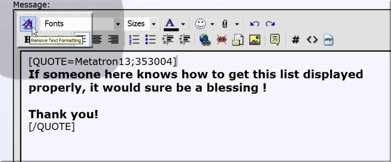
Brother Meta encountered a formatting problem today and it took me a while to figure out an easy solution. I have wondered for years what those two little A's were doing to each other in the corner and why they were so important to give them their own segregated section in the primary position of the toolbar.
It's a great icon, too. (They all are, although I can't figure out why the email icon is necessary.)